What is a generic visual?
![]()
We currently define 'generic visuals' as visuals which have standardized formats and appearances, which perform particular design functions and which circulate with increasing frequency in the news media, such as stock photos and simple data visualizations.
As we find out more about how both stock photos and simple data visualizations are produced, used, circulated and consumed in online journalism, our definition of 'generic visuals' will be extended, reworked, and transformed to reflect our project's empirical findings.
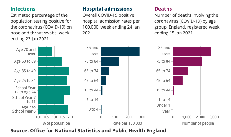
For example, the Office For National Statistics (ONS), the UK’s recognised national statistical institute, regularly produces roundups of coronavirus data. These roundups include simple data visualizations, such as bar charts and line charts, which appear in standardised formats. Below are three bar charts from the ONS from January 2021, showing estimated percentage of the population testing positive for the coronavirus week ending 23 Jan 2021, COVID-19 positive hospital admission rates per 100,000 for week ending 24 Jan 2021, and number of deaths involving the coronavirus (COVID-19) by age group in England registered week ending 15 Jan 2021.
Another big news story at the start of 2021 is Britain's exit from the European Union, which finally took place on 1 January 2021. Stock photos including more or less stylized images of British and EU flags have been circulating widely in the media to represent this story visually. The image below, by MasterTux on Pixabay, is a good example, with the UK - represented as a button designed with the British flag - sitting outside the EU.

Image by MasterTux from Pixabay, 2021.